Change color on "You can't post an empty comment!" & login errors to make them more readable
id: 731074
category: Suggestions
posts: 118
Dec 19, 2023 16:57:26
Change color on "You can't post an empty comment!" & login errors to make them more readable
view on scratch
view on legacy ocular
Zydrolic
 loading
EDIT: Since people complain of it looking ugly (not the purpose of this still and never really mattered), gonna use black text instead since That appears to not fail at the WCAG rating.
#ffab1a (orange) & #fff (aka #FFFFFF (white)) don't mix very well and are a bit difficult to read.
Changing the text color to black could be really useful since its much more readable:
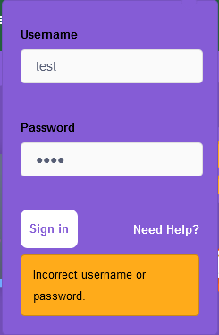
(note this is merely an example, edited version of #36)
EDIT2:
EDIT3:
Mock-up for the one above:

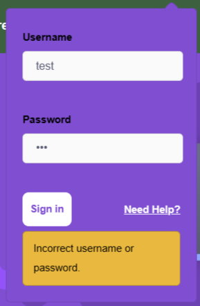
#ffab1a (orange) & #fff (aka #FFFFFF (white)) don't mix very well and are a bit difficult to read.
Changing the text color to black could be really useful since its much more readable:
(note this is merely an example, edited version of #36)
EDIT2:
(#43)This could also work really well since there'd probably be less complaining and it's much more readible.
Why don’t we use the high contrast control block color with black text? That would make it quite easy to read, and fit with the palette.
EDIT3:
Mock-up for the one above:
Dec 19, 2023 18:05:20
Change color on "You can't post an empty comment!" & login errors to make them more readable
view on scratch
view on legacy ocular
roofogato
 loading
No Support, it's already easy to see. The new color just looks uglier it looks like the change to the remix button
Dec 19, 2023 18:07:53
Change color on "You can't post an empty comment!" & login errors to make them more readable
view on scratch
view on legacy ocular
yadayadayadagoodbye
 loading
While the current one isn't that hard to see (as long as you arn't sleep deprived like I am rn), it'd be nice to have the second one, it is a bit uglier (maybe another, similar color?), but its way nicer to my eyes (which are, yet again, super sleep deprived)
Dec 19, 2023 18:08:46
Change color on "You can't post an empty comment!" & login errors to make them more readable
view on scratch
view on legacy ocular
gdfsgdfsgdfg
 loading
No Support, it's already easy to see. The new color just looks uglier it looks like the change to the remix buttonthen what about colorblind scratchers then
Dec 19, 2023 18:09:54
Change color on "You can't post an empty comment!" & login errors to make them more readable
view on scratch
view on legacy ocular
roofogato
loading
Every modern device made my man has a colorblind filter bulit inNo Support, it's already easy to see. The new color just looks uglier it looks like the change to the remix buttonthen what about colorblind scratchers then
Dec 19, 2023 18:13:17
Change color on "You can't post an empty comment!" & login errors to make them more readable
view on scratch
view on legacy ocular
Za-Chary
 loading
I am not sleep-deprived, nor do I have any visual impairments, and I agree that the color could be changed to make it easier to read.
I seem to remember that something orange was changed to red in the purple update — was it the number of messages, as displayed inside the message box? Maybe that could be an alternative color to the proposed dark orange.
I seem to remember that something orange was changed to red in the purple update — was it the number of messages, as displayed inside the message box? Maybe that could be an alternative color to the proposed dark orange.
Dec 19, 2023 18:14:32
Change color on "You can't post an empty comment!" & login errors to make them more readable
view on scratch
view on legacy ocular
roofogato
loading
I seem to remember that something orange was changed to red in the purple update — was it the number of messages, as displayed inside the message box?
No, it's still orange. I'm yet to see anything red in fact
Dec 19, 2023 18:16:05
Change color on "You can't post an empty comment!" & login errors to make them more readable
view on scratch
view on legacy ocular
gdfsgdfsgdfg
loading
alright I will do a WCAG check
the current color contrast is:
1.89:1 (WCAG fail)
The second color is:
2.09:1 (WCAG fail)
The third color is:
2.5:1 (WCAG fail)
Well then none of those colors (the 2 last colors)
passed WCAG tests
this is compared to white text
Edit: OP changed
the current color contrast is:
1.89:1 (WCAG fail)
The second color is:
2.09:1 (WCAG fail)
The third color is:
2.5:1 (WCAG fail)
Well then none of those colors (the 2 last colors)
passed WCAG tests
this is compared to white text
Edit: OP changed
Dec 19, 2023 18:22:17
Change color on "You can't post an empty comment!" & login errors to make them more readable
view on scratch
view on legacy ocular
Zydrolic
loading
(#6)I think you mean the muted or can't post an empty comment messages on scratchr2 pages, I think those were also yellow before the purple update but got changed to red, but I could be remembering way off wrong.
I seem to remember that something orange was changed to red in the purple update — was it the number of messages, as displayed inside the message box? Maybe that could be an alternative color to the proposed dark orange.
Either way I think changing it to red would also suffice incase people find it ugly
Dec 19, 2023 18:23:12
Change color on "You can't post an empty comment!" & login errors to make them more readable
view on scratch
view on legacy ocular
Prince_Wolf1
 loading
The new one looks ugly
Has anyone complained about it?
Maybe just change the text to black. It seemed to pass.
Has anyone complained about it?
Maybe just change the text to black. It seemed to pass.
Dec 19, 2023 18:28:37
Change color on "You can't post an empty comment!" & login errors to make them more readable
view on scratch
view on legacy ocular
gdfsgdfsgdfg
loading
Exception being changing the text color (11.09:1) to black (here)I compared it to the color in the text and the color in the background
but ok
Dec 20, 2023 03:24:18
Change color on "You can't post an empty comment!" & login errors to make them more readable
view on scratch
view on legacy ocular
k7e
 loading
No, he's referring to the message count from inside the message page.(#6)I think you mean the muted or can't post an empty comment messages on scratchr2 pages, I think those were also yellow before the purple update but got changed to red, but I could be remembering way off wrong.
I seem to remember that something orange was changed to red in the purple update — was it the number of messages, as displayed inside the message box? Maybe that could be an alternative color to the proposed dark orange.
Either way I think changing it to red would also suffice incase people find it ugly
I feel like actual black (#000000) would actually seem more off-brand as the color palette “black” color is really a light gray (#575e75). Honestly, #575e75 would still probably have a decent contrast with the light orange, but it would look a lot less aesthetically pleasing than the dark red would.
Edit: Note that the red color is an accessible color that came with the color contrast update.
Dec 20, 2023 03:25:47
Change color on "You can't post an empty comment!" & login errors to make them more readable
view on scratch
view on legacy ocular
Sliverus
 loading
None of the “no support, it's already easy to see and it'll be ugly” posts are taking the main idea of this topic into account. None of the accessibility updates are supposed to be about looking pretty. Nor is it to comply with the law, although that is a big part of it.
Many users have been complaining about how they're unable to see on the site. Making a high-contrast Scratch was long overdue. I've talked many times on the forums about the pros outweighing the cons. The cons of leaving the site blue are enormous. There are tons of users trying to survive in a world geared toward users with perfect vision. Many kids were quite literally unable to use the site, and there were plenty of complaints about it. The only potential pro is that blue Scratch looks better to a number of people. But that's a subjective preference, which is nothing compared to allowing a group of Scratchers to suffer at the expense of aesthetics.
Keep in mind that the Scratch Team is highly likely to implement some kind of option sometime down the road. High contrast is something that needed to be done, but they can make it optional in the future, and they probably will. In fact, I daresay it'll be done within the decade. But I digress.
High contrast is incredibly important for many users, and all the backlash against this suggestion could be very discouraging for them, as there are users who can now see the website for the first time. You can have your own opinions on whether you like it or not, but please make sure you're being considerate of suffering minority groups in the process.
Dec 20, 2023 15:43:52
Change color on "You can't post an empty comment!" & login errors to make them more readable
view on scratch
view on legacy ocular
gdfsgdfsgdfg
loading

Dec 20, 2023 22:48:37
Change color on "You can't post an empty comment!" & login errors to make them more readable
view on scratch
view on legacy ocular
Prince_Wolf1
loading
Dec 21, 2023 00:26:08
Change color on "You can't post an empty comment!" & login errors to make them more readable
view on scratch
view on legacy ocular
EDawg2011
 loading
Huge support. It improves accessibility.
Dec 21, 2023 00:36:38
Change color on "You can't post an empty comment!" & login errors to make them more readable
view on scratch
view on legacy ocular
medians
 loading
I am not sleep-deprived, nor do I have any visual impairments, and I agree that the color could be changed to make it easier to read.It was in the messages page and also blue was changed to red when deleting/reporting comments. There is also red on scratchr2 and since I am medians..
I seem to remember that something orange was changed to red in the purple update — was it the number of messages, as displayed inside the message box? Maybe that could be an alternative color to the proposed dark orange.
Dec 21, 2023 00:47:31
Change color on "You can't post an empty comment!" & login errors to make them more readable
view on scratch
view on legacy ocular
-Expo
 loading
I am not sleep-deprived, nor do I have any visual impairments, and I agree that the color could be changed to make it easier to read.
I seem to remember that something orange was changed to red in the purple update — was it the number of messages, as displayed inside the message box? Maybe that could be an alternative color to the proposed dark orange.
heck why not. We made Scratch purple, no?
Last edited by kaj (Tomorrow 0:00:00)
Dec 21, 2023 00:53:30
Change color on "You can't post an empty comment!" & login errors to make them more readable
view on scratch
view on legacy ocular
ajskateboarder
 loading
I don't know what people are talking about, saying it's ugly. The orange color is literally only used in two spots on every page: those being the logo and the message icon, which are very tiny. This darker color isn't really inconsistent with any other color in that regard. Also it's not like people have much of a say in accessibility changes anyway.
Then why did Scratch need to change their color scheme from blue to purple?Every modern device made my man has a colorblind filter bulit inNo Support, it's already easy to see. The new color just looks uglier it looks like the change to the remix buttonthen what about colorblind scratchers then
Dec 21, 2023 06:12:52
Change color on "You can't post an empty comment!" & login errors to make them more readable
view on scratch
view on legacy ocular
Scratchdev57
 loading
Honestly, the best solution is let everyone customise the colours. But this is fine. It is a bit ugly, but who cares? You'll barely even see this message.
Dec 21, 2023 23:31:20
Change color on "You can't post an empty comment!" & login errors to make them more readable
view on scratch
view on legacy ocular
Zydrolic
loading

(#22)That'd make this a dupe however, and you know that as well.
Honestly, the best solution is let everyone customise the colours.
(#22)I'd rather appease people by going with it but honestly
It is a bit ugly, but who cares? You'll barely even see this message.
why the frick does it matter if it looks ugly if its atleast more readable?
Currently it's quite a pain to read still
Dec 21, 2023 23:35:01
Change color on "You can't post an empty comment!" & login errors to make them more readable
view on scratch
view on legacy ocular
Basilikos
 loading
If you're increasing the brightness difference between text and background that's called increasing contrast not decreasing contrast.
Dec 21, 2023 23:43:45
Change color on "You can't post an empty comment!" & login errors to make them more readable
view on scratch
view on legacy ocular
lgrov44
 loading
Well, if the options of different colours were diiferent, then that would be a good idea, but that small of a change is practically too small of a difference to be useful, even when considering the people who have some form of color blindness or other disorders that affect sight. No support.
Dec 21, 2023 23:46:47
Change color on "You can't post an empty comment!" & login errors to make them more readable
view on scratch
view on legacy ocular
subjectnamehere
 loading
(#26)exactly. it's a small change. it won't take that long*. i'm not vision impaired at least in a way that would make a difference and the change is so much easier to read and doesn't give me a headache
Well, if the options of different colours were diiferent, then that would be a good idea, but that small of a change is practically too small of a difference to be useful, even when considering the people who have some form of color blindness or other disorders that affect sight. No support.
*edit: presumably
Dec 21, 2023 23:52:33
Change color on "You can't post an empty comment!" & login errors to make them more readable
view on scratch
view on legacy ocular
unmissable
 loading
Sorry if offtopic but did the name change?
Dec 21, 2023 23:55:10
Change color on "You can't post an empty comment!" & login errors to make them more readable
view on scratch
view on legacy ocular
lgrov44
loading
Sorry if offtopic but did the name change?Don't think so, what do you think it was before?
Dec 21, 2023 23:55:32
Change color on "You can't post an empty comment!" & login errors to make them more readable
view on scratch
view on legacy ocular
Zydrolic
loading
(#26)There's a lot more smaller changes that happen and yet those are still counted, that includes literally just changing the capitalization of a subforum title (HWS —> HwS)
Well, if the options of different colours were diiferent, then that would be a good idea, but that small of a change is practically too small of a difference to be useful, even when considering the people who have some form of color blindness or other disorders that affect sight. No support.
(#28)yes it did, changed decrease to increase since i mixed up definitions
Sorry if offtopic but did the name change?
Dec 22, 2023 00:02:28
Change color on "You can't post an empty comment!" & login errors to make them more readable
view on scratch
view on legacy ocular
lgrov44
loading
Yes, however, whether they are actually useful depends on the case. In the example you have provided, it still looks quite insignificant to me.(#26)There's a lot more smaller changes that happen and yet those are still counted, that includes literally just changing the capitalization of a subforum title (HWS —> HwS)
Well, if the options of different colours were diiferent, then that would be a good idea, but that small of a change is practically too small of a difference to be useful, even when considering the people who have some form of color blindness or other disorders that affect sight. No support.
Dec 22, 2023 01:12:54
Change color on "You can't post an empty comment!" & login errors to make them more readable
view on scratch
view on legacy ocular
subjectnamehere
loading
(#31)you are not, in fact, the only person to look at it.Yes, however, whether they are actually useful depends on the case. In the example you have provided, it still looks quite insignificant to me.(#26)There's a lot more smaller changes that happen and yet those are still counted, that includes literally just changing the capitalization of a subforum title (HWS —> HwS)
Well, if the options of different colours were diiferent, then that would be a good idea, but that small of a change is practically too small of a difference to be useful, even when considering the people who have some form of color blindness or other disorders that affect sight. No support.

Dec 24, 2023 08:55:46
Change color on "You can't post an empty comment!" & login errors to make them more readable
view on scratch
view on legacy ocular
106809nes
 loading

Dec 24, 2023 13:52:14
Change color on "You can't post an empty comment!" & login errors to make them more readable
view on scratch
view on legacy ocular
scratchcode1_2_3
 loading
(#34)why riggy
anyways support but only if the color is changed to not just be darker since it just looks ugly
Dec 24, 2023 16:04:15
Change color on "You can't post an empty comment!" & login errors to make them more readable
view on scratch
view on legacy ocular
PaperMarioFan2022
 loading
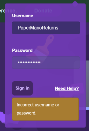
Fixed mock-ups made from scratch using IE (Inspect Element):
Hope that Zydrolic likes these.

Ignore the purple theme. That was custom made by me.
Hope that Zydrolic likes these.
Ignore the purple theme. That was custom made by me.
Dec 25, 2023 14:00:07
Change color on "You can't post an empty comment!" & login errors to make them more readable
view on scratch
view on legacy ocular
Zydrolic
loading
(#36)I'll recreate the mockups with the themes off, I probably should've done it before
Fixed mock-ups made from scratch using IE (Inspect Element):
Hope that Zydrolic likes these.
Ignore the purple theme. That was custom made by me.

js its not because of aesthetics, its readability though ig i might be the only person struggling to read white text on an orange background
EDIT: Also gonna only use the darker text one since people can't stop complaining about it looking ugly, thats not the point of this but still
Dec 25, 2023 15:39:55
Change color on "You can't post an empty comment!" & login errors to make them more readable
view on scratch
view on legacy ocular
PaperMarioFan2022
loading
I'll recreate the mockups with the themes off, I probably should've done it beforeThat's alright. The text with the theme on didn't help as much, so I should probably fix that (including the username and password bits).
I think that I got a little lazy and forgot to leave out my alt's username.
Edit: I now fixed the mock-ups.
Dec 25, 2023 17:11:51
Change color on "You can't post an empty comment!" & login errors to make them more readable
view on scratch
view on legacy ocular
medians
loading
Alright, mockups I guess with the scratchr2 “You can't post any empty comment” colors (though I like grey and red :D: on my sign in errors!!1!1 which I thought it was for all pages but guess not :D:)
(I already had it set XD)
(I already had it set XD)
Dec 25, 2023 22:33:08
Change color on "You can't post an empty comment!" & login errors to make them more readable
view on scratch
view on legacy ocular
usefun
 loading
Yes, the color should be changed. I have a hard time reading the messages and don't have vision problems.
Dec 26, 2023 20:27:03
Change color on "You can't post an empty comment!" & login errors to make them more readable
view on scratch
view on legacy ocular
106809nes
loading
was off first page
Dec 26, 2023 20:52:49
Change color on "You can't post an empty comment!" & login errors to make them more readable
view on scratch
view on legacy ocular
coshnaut
 loading
Why don’t we use the high contrast control block color with black text? That would make it quite easy to read, and fit with the palette.
Dec 26, 2023 20:59:22
Change color on "You can't post an empty comment!" & login errors to make them more readable
view on scratch
view on legacy ocular
Zydrolic
loading
(#43)Since people wouldn't complain on that (atleast I hope) and the contrast would be a lot more readible, I think that would work really well.
Why don’t we use the high contrast control block color with black text? That would make it quite easy to read, and fit with the palette.
EDIT: Adding this to OP as an alternative possibility.
Dec 26, 2023 21:16:07
Change color on "You can't post an empty comment!" & login errors to make them more readable
view on scratch
view on legacy ocular
Caramels_Secrets
 loading
Support! Even though I don't have any eyesight disabilities (Unless being nearsighted and wearing glasses counts), I think the website should be more accessible to those with colorblindness/difficulty with reading low contrast.
Jan 5, 2024 18:23:47
Change color on "You can't post an empty comment!" & login errors to make them more readable
view on scratch
view on legacy ocular
106809nes
loading
Jan 5, 2024 18:44:20
Change color on "You can't post an empty comment!" & login errors to make them more readable
view on scratch
view on legacy ocular
coshnaut
loading
.
Jan 6, 2024 10:40:45
Change color on "You can't post an empty comment!" & login errors to make them more readable
view on scratch
view on legacy ocular
Zydrolic
loading
bump
Jan 7, 2024 14:34:06
Change color on "You can't post an empty comment!" & login errors to make them more readable
view on scratch
view on legacy ocular
Zydrolic
loading
bump